Renault unveils new logo for the electric age
By REUTERS | 16 March 2021
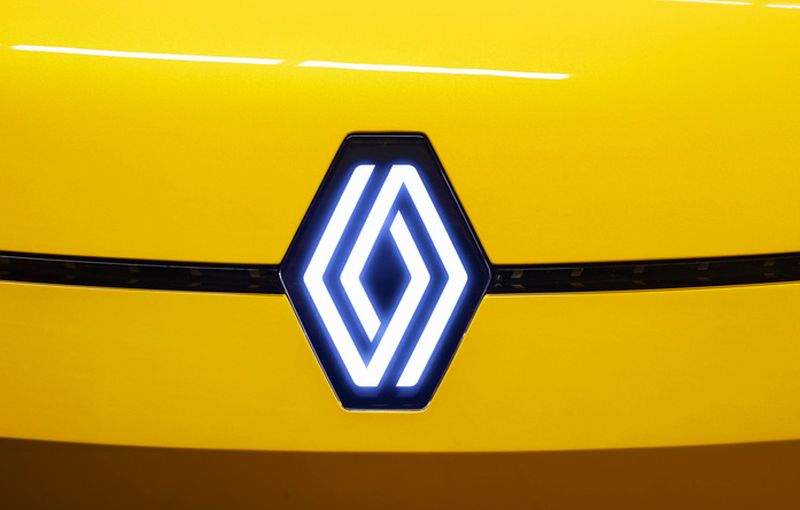
PARIS: Renault has adopted a new version of its iconic diamond logo, saying the move heralds a major electrification drive.
The retro-influenced badge cropped up first on the 5 electric concept car. The French maker said the positive reaction to the logo means it will adorn the entire range by 2024.
The simple new logo, with no signature or typography, is made up of two intertwined black lines and harks back to a 1972 design, which Renault used for two decades before it was given several redesigns down the years.
The diamond shape goes back to 1925 when Louis Renault chose the geometric figure to suit the angled car bonnets of the time.
The flat treatment makes it better for digital and film use than a 3D design, said design director Giles Vidal. "It is a simple geometric shape, with a strong, powerful identity," said Vidal.
"The challenge was to renew this shape by giving it meaning, along with new, contemporary values to project the brand into the future."
Tags
Autos Renault
Reviews

First drive with the 2025 Hyundai Tuscon and Santa Fe: Seoul...

5.8
Kymco AK550 Premium: Smart easy rider

BYD Seal 6 Premium: Sweet deal, generous kit, sensible prici...

8.7
Mazda CX-80 2.5G PHEV AWD High Plus: Upmarket upgrade

Proton X50 Flagship: Tuned for success

6.6
Triumph Trident 660: Beautifully balanced package

8.4
Mercedes-AMG GLA 35 4Matic: Never a dull moment

Lamborghini Urus SE: Ultimate control
Videos

Free & Easy Media Test: Latest Proton X50 Flagship to Kuanta...

Zeekr Space Sunway City Video

Honda Civic Type R Ultimate Edition: Last 40 Units for Europ...
